top of page
Search

Thank you for the positive feedback the Visual Menu received. I have updated the component with an additional feature that was recently requested. A new attribute is now available that allows you to adjust the size of the button! This attribute allows you the specify the pixel size of the box.


Example:

Box Size: 125

Box Size: 150

Box Size: 200

Box Size: 250

Here is the code:

visualNav.html

visualNav.js

visualNav.js-meta.xml


Upcoming Features

  1. Better accessibility

  2. Ability to use custom icons

734 views

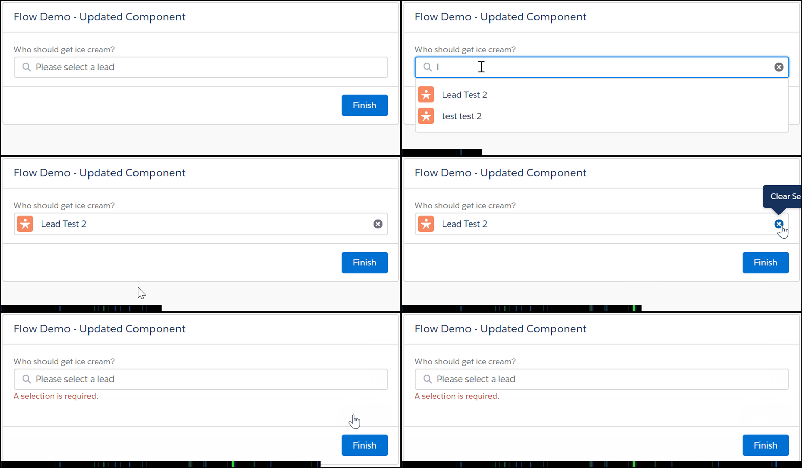
The Unofficial Lookup component from the unofficial Salesforce site is one of my favorite components. It allows you to add a powerful search component to your screen flow. However, the component is one of the oldest on the site, and some very picky users in my organization kept asking me, "Why are the icons not aligned correctly?" during user acceptance testing. Therefore, I decided it could use a new layer of paint.


What was changed?

  1. Used lightning design system to format the search box

  2. Used lightning design system to format the search results

  3. Used lightning design system to format the selected results

  4. Added the ability to add icons

The Results

Go from this

To this

Now it's your turn!

  1. Log into a sandbox or developer org

  2. Install the latest version of the unofficial Lookup component

  3. Open the developer console

  4. Open the files below, and update them with the code below


Open c:lookupFSC

Update Component File

Update Design File

Update Controller and Helper File

Open c:CmpPills.cmp

Update Component File

Open c:LightningLookup

Update Component File

Update Style file


Resources

925 views

Updated: Jan 22, 2020

I recently wanted to add a more visually appealing and user-friendly way to add navigation to my flows. The goal was to allow end-users to select an option quickly, and the flow automatically navigates to the next screen. I used a picklist in the past, but that resulted in extra clicks.

Benefits over a picklist

  1. Come on, it just looks better!

  2. Fewer clicks (1 click vs 3 clicks)

  3. Faster!

  4. Very flexible.

Inputs

  1. Collection - Label - The labels used for each of the buttons

  2. Collection - SubLabel - The sub-labels used for each of the buttons.

  3. Collection - Value - The values used for each of the buttons.

  4. Collection - Icons - The icons used for each of the buttons.

  5. Show Icons? - A boolean to show the icons. The default is false.

  6. Show SubLabels? - A boolean to show the icons. The default is false.

  7. Icon Size - The size of the icon. Options include xx-small, x-small, small, medium, or large. The default is medium.

  8. Required - A boolean to determine if a selection is required to go to the next screen.

  9. Enable Auto Next - If enabled the screen will automatically transition to the next element. Please note there is an accessibility impact when enabling this option. If a user utilizes a keyboard or screen reader that will be unable to get to any other choice but the first.

Please Note

Collection - Label , Collection - SubLabel , Collection - Value and Collection - Icons are required. If you do not plan to use SubLabels or Icons just input the string collection you are utilizing for Collection - Label.


Outputs

  1. Label - Output the selected label

  2. SubLabel - Output the selected sub-label

  3. Value - Output the selected value

  4. Unique - Output the selected value + its index #

This component allows you to out the selected label, sublabel, and value. Therefore, you will be able to use the outputs on a decision element for navigation!


How to generate the menu

  1. Create a text variable that allows multiple values (collection). You will need one for labels, sub-labels, icons, and values.

  2. Then use an assignment element to add values to the collection

You can also combine this with Extract Strings From Collection from unofficialsf.com. Imagine searching for Contacts and then visually displaying the results to the end-user.

I hope this component adds value to your visual flows! Visual Nav is a lightning web component. Therefore, if you haven't created a Lightning Web Component previously I would recommend completing the following Trailhead: Build Lightning Web Components


visualNav.html

visualNav.js

visualNav.js-meta.xml


1,356 views
Home: Blog2
Home: Contact
bottom of page